CSS Grid vs. Flexbox
Discover the key differences between CSS Grid and Flexbox layout systems.
CSS Grid vs. Flexbox: Which Layout System Should You Use?
Both CSS Grid and Flexbox are powerful layout systems available in CSS. Each has its own strengths and best use cases. In this post, we'll explore the key differences between the two and help you decide which one to use in different scenarios.
1. What is Flexbox?
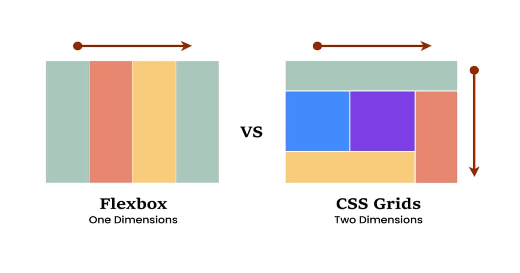
Flexbox (Flexible Box Layout) is a one-dimensional layout system that is designed to distribute space along a single axis — either a row or a column. It’s great for aligning items in a container and distributing space between them.
.container {
    display: flex;
    justify-content: center; /* Aligns items horizontally */
    align-items: center; /* Aligns items vertically */
}
Flexbox is ideal for smaller components or for aligning items within a container. For example, a navigation bar can be easily created using Flexbox:
<nav className="navbar">
    <div className="container">
        <a href="/">Home</a>
        <a href="/about">About</a>
        <a href="/services">Services</a>
        <a href="/contact">Contact</a>
    </div>
</nav>
2. What is CSS Grid?
CSS Grid is a two-dimensional layout system, which means it can handle both rows and columns at the same time. It’s perfect for more complex layouts where you need full control over both dimensions.
.grid-container {
    display: grid;
    grid-template-columns: 1fr 1fr 1fr; /* Three equal columns */
    grid-template-rows: auto; /* Rows will adjust based on content */
    gap: 16px; /* Adds space between grid items */
}
Grid is particularly useful for creating entire page layouts. For example, a simple webpage layout could be structured as follows:
<div className="grid-container">
    <header className="header">Header</header>
    <nav className="nav">Navigation</nav>
    <main className="main">Main Content</main>
    <aside className="aside">Sidebar</aside>
    <footer className="footer">Footer</footer>
</div>
3. Key Differences
- 1D vs. 2D: Flexbox is great for one-dimensional layouts (row OR column), while Grid is best for two-dimensional layouts (both row AND column).
- Content vs. Layout: Flexbox is primarily content-driven, meaning the layout adapts to the size of the items. Grid is more layout-driven, offering more precise control over the overall structure.
- Alignment: Flexbox excels in item alignment along a single axis, while Grid offers more complex alignment options across both axes.
4. When to Use Flexbox?
Use Flexbox when you have a simple layout or need to align items along a single axis. Common use cases include:
- Navigation bars
- Horizontal or vertical centering of elements
- Distributing items evenly in a container
- Creating simple card layouts
5. When to Use CSS Grid?
Use CSS Grid for more complex layouts where you need to control both rows and columns. Grid is perfect for:
- Creating full-page layouts
- Designing multi-column layouts
- Aligning items in both horizontal and vertical directions
- Building responsive layouts with specific area definitions
6. Can You Combine Flexbox and Grid?
Yes! In fact, combining the two layout systems can often lead to the best results. You might use Grid for the overall page structure and Flexbox inside components where you need finer control over alignment and space distribution.
For instance, you could use CSS Grid for the layout of a webpage and Flexbox for positioning items within a specific section, such as a product grid:
<div className="product-grid">
    <div className="product-item">
        <img src="image1.jpg" alt="Product 1" />
        <h3>Product 1</h3>
        <p>$29.99</p>
    </div>
    <div className="product-item">
        <img src="image2.jpg" alt="Product 2" />
        <h3>Product 2</h3>
        <p>$39.99</p>
    </div>
</div>
7. Accessibility Considerations
When using CSS Grid and Flexbox, keep in mind accessibility best practices. Make sure to use semantic HTML elements and consider the order of elements as it can impact screen readers. Flexbox can sometimes lead to unexpected order changes in screen readers if items are rearranged visually.
8. Browser Support and Considerations
Both CSS Grid and Flexbox are widely supported in modern browsers, but if you're targeting older versions of browsers, make sure to check compatibility. Flexbox has better support in legacy browsers, while CSS Grid may require fallbacks for full compatibility.
Conclusion
Both CSS Grid and Flexbox are essential tools in modern web development. Use Flexbox for simpler, one-dimensional layouts, and use CSS Grid when you need a more robust, two-dimensional layout. By understanding their differences and strengths, you can use them together to create responsive, flexible layouts that work across all screen sizes.
Experiment with both systems to see how they can complement each other in your projects!